
Energy Refreshers Are Having a Moment, and Honestly, We Have the Colors for That

Okay so I have to be honest with you, I have spent a completely embarrassing amount of time in drive-throughs lately. Not because I need the caffeine, although I always need the caffeine, but because I cannot stop staring at what these places are doing with color. And it was like, at some point over the past couple of years, every single coffee chain and fast food spot in America collectively decided that drinks needed to be bright, tropical, and frankly kind of electric. And I am here for it.
So anyway, here is what sent me down this particular rabbit hole. We were talking internally about some fun video content we wanted to put together featuring our markers, and I started thinking about where we see our colors showing up in the world around us. And then I realized, oh my gosh, I see our colors every single time I pull up to a Starbucks. Or a Dutch Brothers. Or a Panera, which, side note, has an energy drink situation that I think does not get nearly enough credit. These refreshers, that is what they call them, energy refreshers, they are everywhere now and they are just absolutely gorgeous to look at. Mango. Watermelon. Berry. Bright pinks and oranges and deep purples and the kind of greens that make you think of something tropical and far away from wherever you currently are.
Here is the thing about color in retail. I have been studying it for decades now, and the brands that figure out color first are usually the brands that win. Dutch Brothers really started pushing this hard, I think, with those beautiful neon drink colors that you can see from across a parking lot. Starbucks followed with their refresher line, and now everybody is doing it because everybody figured out the same thing at the same time, which is that people do not just want a drink, they want a drink that looks incredible sitting in their cupholder while they drive. They want something that photographs well. They want that hit of visual joy before they even take a sip.
And I am sitting there in the drive-through, studying these drinks like a total weirdo, and I keep thinking, those are our colors. That mango orange? That is basically our Tangerine Dream. That deep watermelon pink? That is sitting right there in our tropical pack. The bright berry purple? We have that, and it's called Velvet Fog. We have all of that, and it is sitting in retail stores and it could be doing so much more.
This is kind of how my brain works, and I know it is a little chaotic, but I genuinely cannot look at anything in the world without immediately connecting it back to what we make at Chalk Ink®. My dyslexia means I process things visually before I process them in any other way, so color is always the first thing I notice and the last thing I forget. And right now, what I am noticing everywhere I go is that the color story happening in the beverage world is almost identical to the color story we have been telling for years with our tropical collections.
So we decided to lean into it. We are putting together a video featuring some really fun ideas built around all of these amazing energy drink aesthetics, and we are going to use our 15 millimeter and our 6 millimeter markers to show what you can actually do with these colors in a real retail environment.
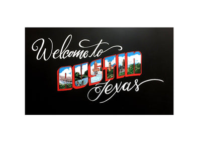
 The 15 millimeter is your big bold statement maker, great for those wide sweeping color fills and the kind of signage that stops someone mid-step.
 The 6 millimeter is where you get your detail work done, the fine lines, the fun lettering, the little illustrated elements that make a sign feel handcrafted and personal rather than just printed.
 And honestly, if you have our chalky tropical pack sitting around, this is the moment for it. Those soft, slightly muted tropical tones are having such a retail moment right now because they feel premium without being cold. They feel fun without being overwhelming. They are exactly the vibe that every one of these energy refresher brands is chasing, and you can create that same feeling in any retail space with our markers on basically any non-porous surface.
I think what excites me most about this is that it is a reminder that inspiration is everywhere if you are paying attention. I did not have to look at a design magazine or a trade show floor to figure out what our next video should be about. I just had to sit in a drive-through for long enough and actually look at what was happening around me. The colors that are winning in the market right now, the ones that are making people pull out their phones and photograph their drinks before they even taste them, those are colors we have been making for years. We just needed to connect the dots a little louder.
So keep an eye out for the video on our socials. There are going to be some genuinely great ideas in there, and I think if you have never thought about how energy drink aesthetics translate to chalk marker signage, this might kind of blow your mind a little. Or at least make you want a watermelon refresher, which, same honestly.
Facebook: @chalkinkmarkers
Instagram: @chalk.ink
TikTok: @chalkink
Linkedin: @Chalk-Ink
Til Next Time.
