
Summer Refreshers: Why Our Colors Were Made for This Moment

Phase two of the Summer Refreshers series, and honestly it might be my favorite thing I've talked about yet because it's all just so visual and bright and fun and it really does show exactly what Chalk Ink® is all about when you think about it.
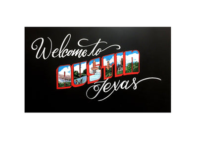
A little background if you're new here: I spend a genuinely embarrassing amount of time noticing what retailers are doing with color. Like, I cannot go into a grocery store or a coffee shop without clocking their signage and thinking about what markers they used or should have used. My brain just does not turn that off. My team thinks it's funny. I think it's a professional hazard. Either way, summer is the time of year when everything goes tropical and bright and loud, and that is exactly where we live.
Starbucks and the Tropical Butterfly Refresher
Let's start with Starbucks because honestly, when do we not start with Starbucks. They are launching something called the Tropical Butterfly Refresher and when I heard that name I immediately started seeing colors in my head, which is just how my brain works and has always worked, and it is either a gift or a curse depending on the day. For this particular drink, the colors that came to mind immediately were Grape Jelly, Showgirl, Honey Girl, Green Tea, and Velvet Fog, all in 15 millimeter. And when I say these colors were made for this moment, I genuinely mean it. They are enormously bright and vibrant and they scream summertime in the best possible way.
Here's the thing about a name like Tropical Butterfly Refresher: it tells you everything you need to know about the energy they're going for in stores. Big, beautiful, eye-catching, a little whimsical. And I can already picture in my head these enormous butterflies made with Honey Girl and Show Girl on a window or a chalkboard display, just stopping people in their tracks on the way to order their drink. That is the kind of thing we are going to be making some videos about this week, actually, so stay tuned for that because I think it's going to be really fun to see those colors come to life together.
We've had a long relationship with Starbucks and with the kinds of retailers who take their seasonal rollouts seriously, and what I love about this is that it's a real example of how our color library was built with intention. When you have 45 named colors that cover the full spectrum of vibrant, bold, and unexpected, you end up being the right fit for whatever moment a brand is trying to create. That doesn't happen by accident.
Dutch Brothers and the Lemonade Energy Situation
Now Dutch Brothers! If you're not already a fan, they’re doing something really interesting with energy drinks and lemonades, and I’ve been paying close attention. They use these absolutely stunning color combinations that are almost tropical without being predictable, and when I look at what they're doing visually, the Chalk Ink® colors that jump out to me are Mediterranean Blue, Eco Green, Piggy Bank Pink, and Something Turquoise. And it was like, yes. That is it exactly. That is the Dutch Brothers summer energy.
 Something Turquoise is one of those colors that I named because the moment I saw it mixed up and coming out of the marker, I genuinely could not think of a more accurate description. It's not just turquoise. It's something turquoise. There's a feeling to it. And combined with Piggy Bank Pink and Mediterranean Blue, you end up with this palette that is fun and energetic and a little retro and very summer. If you're a Dutch Brothers location manager or a franchisee trying to figure out how to make your drive-through signage pop for the season, these are your colors. I'm just putting that out there.
Panera and the Neon Pink Lemonade Moment
And then there's Panera. Panera does these refreshing drinks and they lean hard into a very specific vibe, which is clean and bright and a little bit elevated but still approachable, and for that I immediately think Showgirl, Pink Lemonade, our neon pinks, our neon colors overall, and definitely White. White is one of those colors that people sometimes overlook in a neon-forward palette, but it is absolutely essential for contrast and for making everything else pop even harder.
The Panera refresher drinks feel like summer in a cup in a very intentional way, and their stores have this aesthetic that lends itself really beautifully to chalkboard signage done right.
 Pink Lemonade as a color is exactly what it sounds like, which is this warm, optimistic, happy pink that just works on a menu board or a window cling or really anywhere you want someone to feel good about their drink choice.

And Show Girl next to it is just, I mean, come on. That combination is genuinely joyful.
What All of This Actually Means (For Real Though)
Here's what I keep coming back to every time I do one of these walkthroughs in my head or on audio or now apparently in blog form. All of your favorite places to get an ice cold beverage are using the same language of color to tell you it's summer, it's fun, and it's worth stopping in. The tropical fruit ingredients, the bright packaging, the seasonal menu names. It's all one big visual conversation happening across thousands of retail locations, and Chalk Ink® markers are a genuinely perfect fit for every single one of them.
I built this color library over a lot of years and with a lot of very specific retail moments in mind. Having dyslexia actually made me better at this in some ways, because I've always processed the world more visually than most people do. I see the color first, I feel what it communicates before I can explain it in words, and that instinct has shaped every name and every formula we've developed. Honey Girl isn't just a yellow. Eco Green isn't just a green. They are specific feelings at a specific moment, and summer refresher season at Starbucks, Dutch Brothers and Panera is the exact moment they were born for.
So shout out to Panera. Shout out to Starbucks as always. And shout out to Dutch Brothers for doing what they do with lemonade and energy drinks and really committing to the color story. We'll have videos up soon on our socials, showing some of these combinations in action, and I promise they are going to be very satisfying to watch. Come find us when you want to see what Show Girl looks like next to Honey Girl on a big butterfly, because that is going to be something.
Facebook: @chalkinkmarkers
Instagram: @chalk.ink
TikTok: @chalkink
Linkedin: @Chalk-Ink
Til Next Time.
