
Why Funny Signs and Clever Names Are Basically My Love Language

Okay so I realize that titling a blog post about signs and color names might seem like a very niche thing to get excited about, but I promise you if you stick with me here, this is actually a story about people, memory, and why the details of a business matter way more than anyone gives them credit for. Also, I've been in the sign business for a really long time, and I basically cannot stop looking at signs wherever I go, so at some point you just lean into it.
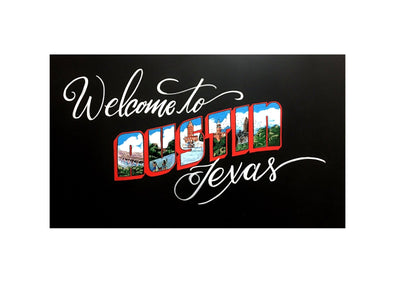
So anyway, back when David Letterman was still on TV, he used to do these hilarious segments where he'd ask viewers to send in pictures of signs. And some of them were completely unintentional but absolutely ridiculous. Like the sign maker had zero idea what they were putting out into the world and yet there it was, out there being wonderfully weird and funny. I think about those segments a lot, actually, because I spend a significant portion of my life looking at signs. It kind of comes with the territory when you're doing what we do at Chalk Ink®.
A sign made of cool neon, a sign painted with something unusual, a sign written with one of our chalk ink markers or even one of our competitors' markers (I'm always studying those too, honestly), a sign scratched out with chalk or literally just written with a rock. Signs are everywhere and signs are fun, but the ones that are clever or funny? Those are the ones that stop you cold and make you actually pay attention. And that's the whole game, right. Getting people to actually stop and look.
The Story Behind the Names, Because There's Always a Story
Here's the thing about our Chalk Ink® markers: we named all of them, and they all have a story behind them that is completely personal. This was not a marketing decision. This was just me being me, which is that when you own your own business and you have your own line of products, you get to name things after people and moments and memories that actually matter to you. And that's exactly what we did.
 Granny Bird Blue, for instance. That's one of our blue shades, and she was named after the grandmother of some very dear friends of mine from Abilene and Levelland. Her name was Granny Blue and she had this slightly blue hue to her hair, which I dearly loved. She was one of the loudest, most boisterous singers in church. Just belting it out. We loved her dearly, and when we were sitting around trying to figure out what to call that particular shade of blue, it was just obvious. That color is Granny Bird Blue. Full stop.
 Then there's Honey Girl, which is one of our gold colors that we added more recently, and that one is named after my mom. Her nickname has always been Honey Girl and that's what all her brothers and sisters and relatives called her growing up, and I just thought, well, that's a tribute I actually want to make. So we did.
 Last but certainly not least, there's Parker's Dreamsicle, which is a light orange color. Parker is my son, and the name comes from when we were opening stores for Whole Foods in the early days. I was in charge of all the menu boards, which, I mean, that was essentially my whole job and entire existence at that point, and one of the drinks on the menu was this Dreamsicle thing, kind of like an Orange Julius situation. Parker was always on site with me in a baby backpack, and he would drink those things constantly. So we added him to the menu. And now he's a color.
I think that's one of my favorite things about building something from scratch. The decisions that sound small on paper, like what you're going to name a marker color, actually end up being some of the most meaningful ones. Because those names carry real people in them. Every time someone orders Parker's Dreamsicle or Granny Bird Blue, they're ordering a little piece of a memory that I genuinely care about. And it makes me happy every single time.
The B2B Dream List, and Why Domino's Should Really Call Us
So here's where the business side of my brain takes over for a second, because I can't help it. We are actively trying to land some big B2B customers right now, and I am not even a little bit shy about saying who they are.
Subway, for starters. Smiley Face Yellow, Astroturf Green, and our Chalk White are basically made for Subway. The color story just works. And Domino's, I love your pizza, I genuinely do, and Clown Nose Red, Pacific Blue, and Chalk White are sitting here absolutely perfect for your brand. Here's the thing that I think about when I think about Domino's specifically: they have a chalkboard inside every single location. And I'm just out here thinking, that could easily be our chalkboard paint. We could do a better job and I know it. So if anyone from Domino's is reading this, which obviously you are because you're very smart people, please give us a shout. We would love to take care of you.
And McDonald's, who is bringing birthday celebrations back inside their restaurants, which I think is genuinely one of the best ideas they've had in a while. Smiley Face Yellow, Chalk White, Clown Nose Red. That's the palette. Imagine being a kid named Emma and walking into a McDonald's for your birthday and seeing your name written up on the board. That's a moment. That's the kind of thing kids remember. Signs do that. Names on signs do that. It matters more than people realize.
Show Us What You've Made, Seriously
One of the things I love most is seeing what people actually create with our markers out in the world. A funny sign, a really clever menu board, something that made a customer stop and laugh or just go "oh wow, that's cool." Those are the things I want to see. If you've made something great with our markers, or even something that turned out a little crooked and imperfect but you're proud of it anyway, send it to us. You can reach me via email at danielle@chalkink.com, or post it on socials and tag or any of our social channels and we will absolutely share it. We can be found on Facebook (@ChalkInkMarkers) Instagram (@chalk.ink), and TikTok (@chalkink). We want to show them off because that is honestly what this whole thing is about.
Signs are fun. Names are fun. And clever, funny, personal things that make people actually feel something? Those are the best things. That's been the whole point from day one, even when I'm still figuring out what blogging is supposed to look like. Ha. Working on it.
